I got some little pots of historical paint colours, having checked out which wall colours were possible circa 1700. Stone colour was popular, as was a dark blue and a yellowish ochre, so I grabbed some examples of those and painted some swatches so I could look at some blue and white plates against the colours.
I like this dark blue, but it's a bit predictable with the blue and white.
I like this stone grey, too, but it's a little dull for this particular room. I want this room to be quite pretty :)
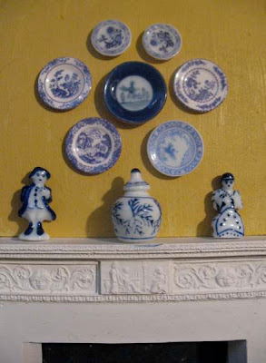
Okay, now we're talking! Elga sent me some photos of her own delft-ware against a yellow wall. You can't beat blue, white and yellow, can you? I think this is very pretty.
Here's some plates against the red wallpaper:
And here's the same plates against an earth-toned paper:
What do you think?
Playing With Rocks...
-
The Folly Garden Landscape....
It Was already well over a year ago, Dear Readers, that I began the
"improvements" to The Folly Garden Landscape in the...
6 days ago


.JPG)


What a wonderful way to display all your blue and white china. I love seeing it on the wall. As for the colors... I think it get a little lost on the wall paper. My first choice would be the very dark blue my second would be the yellow. Not having seen what else goes in that room...All I am thinking about is the china. I guess it all depends on what sort of mood you want the room to have.
ReplyDeleteDefinitely yellow. I love how the blue stands up among the yellow.I may be biased because my real home walls ARE yellow but I truly like it.
ReplyDeleteI agree with Catherine about the wallpaper. Rosanna
PS thanks for the link to Petitpointers; I asked to join it
What a challenge, Nina! I love the yellow walls.... and I know they were authentic in the eighteenth century.... not so sure about the seventeenth century? One does picture the dark paneled walls.... and I tend to agree that the china gets lost against the patterned paper. But, with all that said, I LOVE detail and pattern and complexity and I really like the china against the patterned wallpapers! And I really like the ochery goldish one....perhaps because it feels older than the red one!
ReplyDeleteWell you know I like the yellow, I think since the William and Mary period was so late in the 1600's that yellow is probably ok, here is a link to some info http://www.oldandsold.com/articles03/decorating11.shtml
ReplyDeleteI love the grey, but the china looks beter on the yellow I think! I don't like the wallpaper..too distracting!
ReplyDeleteI like the dark blue and the yellow. If you want sophistication, I think the dark blue, but as you said you wanted pretty, the yellow wins. :)
ReplyDeleteWhat a wonderful collection of porcelain ...
ReplyDeleteFor sure I prefer the yellow background, especially if the furniture is walnut.
Among other things, this is a popular choice in many historic houses and be original is not required :-)
Mini hugs, Flora
The plates certainly make more of an impact on the yellow background. I think the detail of them gets lost on the patterned wallpaper so, for me, it's got to be the yellow!
ReplyDeleteI would probably use the red wallpaper ;) but the yellow is a good contrast with white and blue.:)
ReplyDeleteThanks so much for your comments, guys! Collaborative mini-making -- the wave of the future :)
ReplyDeleteI think I'm going to do yellow-painted panelling, with perhaps some touches of wallpaper. I'll see how it goes.