Saturday, January 29, 2011

Okay, this isn't a miniature post, either :)

I've been doing other things besides minis lately, so this isn't a mini post either, sorry!

I went to the store on Thursday to buy stuff to make baklava with the Knitwits (it went brilliantly and now home made baklava is my most favourite dessert ever :) and the store had tulips on sale.  It was fate.


The funny thing is that I've never really liked tulips all that much, but since researching the 17th century, I have come to love them because of the amazing vases designed just for them.   I also planted some wild and wonderful frilly ones in my front garden that delighted me for weeks this last spring, so I've had a change of heart towards tulips and I'm very happy.  It seems beastly to dislike a flower, somehow.

And here's a photo of the entire Welsh dresser that David made for me a couple of years ago for my blue and white ware and pewter.  He designed it extra tall just to fit into this little space we had in our dining room area:

Wednesday, January 26, 2011

Not a miniature at all -- but a really pretty vase!


I've finally got myself a 1:1 tulipiere or five fingered vase of my very own!  Isn't it pretty? I saw it on eBay a few weeks ago, agonized over it, and finally broke down and made an offer which the seller accepted.  (My grandmother always had a saying, "If you like a thing, you like it so much better".  I don't know what the hell she meant, except that if a material object calls to you, and you can afford it, you might as well give in and get it :)   It now has a proud place on my Welsh dresser!

I just had to share this with the only group of people I know who might begin to understand why I'm so excited about this damned thing :)

Thanks for letting me burble at you!  Next post will really be about minis, I promise.

Thursday, January 20, 2011

TIny tulips from Thailand!

I received a tiny package of spring in the mail from Thailand, yesterday.  Look at these little lovelies! 


Aren't they perfect?  They're clay tulips (made, I think, from Luna clay) in blue and white containers from new eBay seller happymemyshop, who sometimes has 1:12 scale flowers for sale.  They are so much prettier than they were in their photo, and they are superbly made and finished.  Hey, it's a circa 1700 room with blue and white Chinese export pottery, there HAVE to be tulips in there, somewhere :) And until I get my act together and make some, I figured I should pick these up when I saw them.


Wednesday, January 19, 2011

Miniature crewel work kits

Original 1:1 firescreen crewel pattern by Phillipa Turnbull of http://www.crewelwork.com
I love crewel embroidery, mostly because I associate it with the Jacobean period. Of course, crewel work was popular all through the 17th and early 18th centuries, as well, and had a revival in the 19th century along with other "Olde English" handicrafts. (It also had a revival in the 1970s when it was, apparently, used mostly to produce orange owls ... :))  I'm longing to learn how to do it in 1:1 scale, but I'm intrigued with 1:12 scale crewel work, too.

There's a single 1:12 crewel work firescreen in Sue Heaser's book Embroidery Projects, which I look forward to trying.  And I've just heard that miniaturist Cookie Ziemba has come out with a series of darling miniature crewel kits which are for sale on her blog, Cookie's World of Historic Dolls Houses and Miniatures

I find it interesting that there are so many handicrafts I've been interested in trying, and that it's taken getting into miniatures to make me actually explore them :)

Tuesday, January 18, 2011

Petit point pole screen

(How alliterative :)

Here's the 17th century Ming Dynasty dais cloth that was the inspiration for this piece of needlepoint.  Isn't it beautiful?  I love the fact that the dragons are so stylized that they become almost abstract. 


I finished the stitching last night and made up the screen today!

 Here's the stitching all done. (This is on 40 ct gauze.  I used a method of mounting the gauze for stitching recommended by one of the members of the Yahoo Petitpointers group -- gluing and then taping the gauze to a mountboard frame.  Worked like a charm, and stayed taut the whole time).


And here it is ready to be mounted on the screen.


I wanted to be able to hide the ends of the gauze and glue the piece in place, without risking glue seeping into my petit point.  I cut a square of laminated paper (from a postcard, actually) and used that as a backing, gluing the edges of the gauze around it.


And here's the petit point chart for your own use -- this would make a nice cushion as it is, or a larger firescreen if done on 32 count canvas. 

Sunday, January 16, 2011

Petit point in progress for a pole screen

Over the last couple of days I've been working on a little project for the Blue and White Room -- a pole screen.  I've got a McQueenie Miniatures kit I picked up from eBay, and I've designed a piece to fit -- it's 51 stitches square on 40 count silk gauze, and I based it on a Ming dynasty dais cloth, so it's the right period :)

It's actually coming along really quickly, even though I have to count like the dickens when I stitch it (this is the second time I've started it -- the first time I made a basic mistake in counting and tried to rearrange things around my mistake and then I chose a colour for the central motif that was far too close to the background.  It was really ghastly!) 


And here's the McQueenie kit -- I love their kits, even though the mahogany they use is not period for projects before about 1730. I'll do my usual -- stain it oak to tone down the red and see how that goes :)  They're all well constructed and go together easily.

It's a really pretty screen design.


You can buy McQueenie kits either directly from their website or from Minimum World.

(There's a wonderful article on the history of fire guards or pole screens in The Antiquarian.)

Thursday, January 13, 2011

Marbeling tutorial

After looking at the photos and hearing your comments, I decided to do a faux marble finish on the Blue and White room's fireplace mantelpiece.

And I took pictures :)

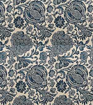
1.  Reference photo  When you're doing any kind of faux finish (and that includes many things we do in the miniature world, from making mini food out of polymer clay to faking bricks on the inside of a fireplace), it's best to have a reference photo, or several.

Here's mine, which you may have seen in an early post -- it's from Chatsworth House:


I like the idea of a grey marble mantel to cut some of the "prettiness" of the gold wall colour.

2.  Base colour   Most marbles begin with a pale base colour, either white or cream.  This one certainly could have, but I decided to start with a deep base colour, namely the tester pot of Amherst Gray last seen as the stone coloured test wall behind the blue and white plates.  It's just about perfect!  I painted both the hearth and mantle with two coats.  (NB:  This is a plaster mantel.  At a couple of small points (including one of the caryatid's noses) I moved too quickly with my water-based paints and sort of "melted" tiny bits of the plaster!  Probably best to let things dry thoroughly between coats, instead of going at it like a mad thing all in one gasp, the way I did :)


3. Two colours of glaze.  In order to create this look, the paints you put on top of the base coat need three properties:  they need to be somewhat transparent,  they need to be "smooshable" i.e. moveable, and they need to have a longish open time, i.e. they can't dry too quickly.  This is especially important because I'm using ordinary artist's acrylic paints -- they dry quickly and hard. 

There are many products for acrylic paints which make a great base for a glaze -- I used a matte medium.  Any acrylic medium that extends the drying time will work beautifully.

Working very quickly, paint on diagonal wiggly lines of the two colours (I used raw umber and the wall colour, a pale gold).  I painted the raw umber first, and you can see in the photo below it's drying already -- not good!  (You can also see that all this detail is going to be a pain in the arse to marbellize :))


This one is better, on the top of the mantle :) Smooshier, wetter.


Now take a small piece of cotton cloth or a bit of sponge, and smoosh the two colours gently together.  You'll still see some of the base coat, and you should still be able to make out the two coloured glazes.  Refer to your reference photo.


3.  Veining.   Once you've got the glazes to your liking, it's time to add veining, one of the most characteristic features of marble.  Most marbles have white veins, some marbles are veined in black. My example has white veining, but also areas of a burnt sienna sort of warm red colour.   I perhaps should have put that in as a glaze, but I'll do it with a small brush at this point, instead :)  Use a very, very fine brush.

In general, veining follows the lines of the coloured glazes, with little side trips :)


4.  Final details and varnish.  Go back over your piece, referring to the photo.  Look at it from a distance and close up.  Does it please you?  You can always use your base paint to tone things down or to "erase" areas that aren't pleasing and start again :)

Generally the rule of thumb for miniatures is "don't make large things glossy", because too-glossy woodwork or furniture disturbs the illusion of scale.  If anything, we generally use Dull-Kote or other means to try to keep surface finishes from being too reflective.  Marble is an exception -- it's not marble unless it has a suggestion of surface polish.  I used a satin varnish for the fireplace.

And here it is, in the room, this morning! 


Now I'm eyeing all those other white fireplaces in the house .... Look out!  It's a Marble Attack!

Wednesday, January 12, 2011

First wall in the Blue and White Room


I find it really helpful to photograph things in process -- for some reason I can be more dispassionate looking at a photo rather than at the scene itself.  (The macro setting is amazing, isn't it -- I keep finding all sorts of infelicities when I examine things close up :)) Looking at this first wall, I think I want framing over the mantle, too.  Looks a little bare.  Should I "marble" the fireplace or leave it be, I wonder? 

The colour, Stuart Gold, looks paler than I thought it would -- it's certainly a little too pale for the period.  But I think it's pretty, so here's another place where historical accuracy will take a back seat to "but I like it!" :)

I've got a McQueenie's fireplace screen kit, so I'm busy designing a Chinese-themed blue/white/gold petit point pattern for it!

And I still need to go down to the workshop and cut those walls!

Tuesday, January 11, 2011

Bellpull finished


Here's the finished bellpull, photographed against the Stuart Gold of the wall I'm working on.

Now I need to go down to the workshop and cut the two inside walls for the first floor, so that I can start assembling things.

Hope you're all having great mini days!

Monday, January 10, 2011

Sampler and frame


This morning I made a little frame for the sampler from some moulding I had lying around.  I know from real life art that a frame always makes a piece look about one third better than it does without a frame!  I'm going to stain the frame oak to go with other pieces in Mum's roombox. (Edited to add photo of stained frame, below).

The sampler I just fabric-glued to a piece of card, let it dry, and then trimmed it to fit the frame.  Very easy to do.

I've decided to go with the gold/yellow for the Blue and White Room -- thanks to everyone for chiming in!  The colour is called "Stuart Gold" by Benjamin Moore, so I need to do my panelling first and then get painting!

Sunday, January 9, 2011

Sampler on 40 ct silk gauze

On Friday the piece of 40 ct silk gauze I ordered from eBay arrived, and yesterday, with a certain amount of trepidation, I started stitching a tiny sampler, destined for my Mum's Edwardian roombox.

This is my first piece on 40 ct, and it shows :) I made a basic mistake, and I picked out a couple of places, but this particular sampler project goes really quickly because you don't stitch the background -- I'll mount it on a piece of off-white card before I frame it.  Mistakes aside, working on gauze is truly addictive! 

The chart is from Sue Heaser's book Embroidery Projects, by the way.  The finished piece is about an inch wide and an inch and a third long.  (Because it's for my mum, I signed it with my maiden initials, NH :)

Saturday, January 8, 2011

Choosing colours for the Blue and White Room

I got some little pots of historical paint colours, having checked out which wall colours were possible circa 1700.  Stone colour was popular, as was a dark blue and a yellowish ochre, so I grabbed some examples of those and painted some swatches so I could look at some blue and white plates against the colours.


I like this dark blue, but it's a bit predictable with the blue and white.


I like this stone grey, too, but it's a little dull for this particular room.  I want this room to be quite pretty :)


Okay, now we're talking!  Elga sent me some photos of her own delft-ware against a yellow wall.  You can't beat blue, white and yellow, can you?  I think this is very pretty.

Here's some plates against the red wallpaper:


And here's the same plates against an earth-toned paper:

What do you think?

Thursday, January 6, 2011

Bellpull stitiching done


Yesterday I finished the stitching on the bellpull -- I'm in the process of hemming it and adding the pewter top and a tassel on the bottom!

I've learned that one should never carry a dark coloured thread from one area of the canvas to another, because it WILL show up behind a light background :)   Good lesson to learn!

And I learned how much I love stitching on silk gauze. I'd like to thank the Petitpointers and my other friends in the mini world for your encouragement to give this a try!

What skills have you learned in the mini world that you never thought you'd have?

Wednesday, January 5, 2011

My Mum's Edwardian Roombox -- post Christmas photos

Last Mother's Day David and I built an Edwardian-era 1:12 scale roombox for my Mum, and we've been filling it with goodies ever since :)

Tuesday is usually the day I spend with my Mum, hanging out with her, shopping with her, helping her with things.  Well, we had a great time yesterday, and I got a chance to take some photos of how she's arranged her roombox to incorporate her mini Christmas presents.


I think she's arranged things really nicely :)  I love you, Mum!

Tuesday, January 4, 2011

Links for petit point sites and resources

Bobbie Schoonmaker's Afshar rug on 40 ct silk gauze

Needlepoint
is the general term for embroidery worked on a counted canvas or fabric using tent stitch (continental stitch) and basketweave stitch.  Gros point is the larger scale stuff, worked on size 16 ct canvas and above (16 ct to 8 ct per inch).  What we use in the miniaturist's world is petit point.  Definitions for petit point vary, but the current consensus seems to be that petit point is small scale needlepoint, especially on silk gauze, smaller than 18 ct (22 ct, 32 ct, 40 ct, 48 ct up to 100 ct!)

START HERE :)

Petitpointers group on Yahoo:  the best, most active group of people doing petitpoint on the Internet.  Most of the members are working on silk gauze, in the 40 ct range and smaller, but they're VERY welcoming of all people, including beginners, and there's no pressure to do anything but have a good time at whatever level you're working at.  Very inspirational, and a very supportive group of people.

ABOUT PETIT POINT


The Needlepoint community at About.com

 Miniature Needlework Society


SHOPS SELLING SCALE PETIT POINT KITS, CHARTS AND SUPPLIES

Micro Stitchery -- IGMA Fellow Bobbie Schoonmaker's charts and kits available here, most of them on 40 ct silk gauze.

Miniature Home -- IGMA member Melissa Boling's charts and kits here, most on 40 and 48 ct.

Janet Granger --  Beautiful charts and kits, mostly at the larger end of the petit point definition (18 - 32 ct, some on silk gauze).  She also sells some supplies.  Great starting place for beginners!

Mini Stitches -- Annelle Ferguson's site, with silk gauze kits (mostly gorgeous samplers) available

Stitches in Miniature -- some very pretty carpet designs on 22 ct canvas.

Magic Miniatures -- historical works of art charted for petit point -- some very high count charts (70 ct) and many more at 40 ct.  Charts only, some can be downloaded, which is convenient.  A wide variety of subjects.

Felicity Price -- Patterns and kits on 22 ct canvas.  Some really lovely designs -- I have her book, too :)

Cookie Ziemba -- gorgeous kits for miniature crewel work (okay, it's not petit point, but it's beautiful :))

Janet Granger Willow pattern bellpull in progress

Months ago I ordered two kits from dolls' house needlepoint artist Janet Granger:  a cushion kit on 18 ct canvas and a blue and white bellpull on 32 ct silk gauze.

That bellpull kit has sat in my workroom for months, waiting for me to get up the courage to try stitching on silk.  Well, I started it a few nights ago, thanks to the encouraging effect of hanging out with the Petitpointers group on Yahoo and looking at their amazing work on silk gauze.

It's inspiring, I tell you!


So here I am, a couple of days later, with the design all stitched and a new obsession -- stitching very small things on gauze.  This is about half an inch wide, by the way.

This looks very messy -- I'm sure I'll get better at it -- and I totally botched the whole "find the centre of both the gauze and the chart and match them together" thing, because I was running out of room at the bottom of the piece and had to excise about 5 stitches from the pattern :)  You can see how close it's getting at the bottom!

But it's a very pretty pattern and surprisingly easy to do.  Actually, I found it easier to stitch on 32 ct gauze than on 32 ct evenweave fabric or canvas -- because the warp and woof threads of the gauze are so fine, the spaces are bigger, and easier to see.  And it's VERY satisfying because the whole thing is so dainty.

Close up of the top of the pattern.
I'm starting a resource list for petit point links and shops, largely to organize my own collection of links, but also in case it's of use to other people.

Sunday, January 2, 2011

Finished carpet in the bedroom and start on Blue and White Room


Here's the finished carpet in the bedroom, with its edges hemmed :)  I've always loved oriental carpets and can't afford the real thing, so I think I'll start a collection of needlepoint ones in miniature!


Here's the start of work on the fireplace wall in the Blue and White Room.  I'm still hemming and hawing over the wallpaper.  This pattern is based on a scrap of early 18th century wallpaper which I laser printed.  I can do it in other colourways, too -- but I chose red because I didn't want my blue and white china to disappear against its background.  I want to mount blue and white plates in an arrangement above the fireplace, comme ça:

Okay, it's not period, but it's yummy :)  Photo from Better Homes and Gardens found at http://bijoukaleidoscope.blogspot.com/2008_05_01_archive.html

The wainscotting will be painted a coordinating colour to whatever I choose for the wallpaper.

What do you think?  There's the dark red, or I could do a dark blue, which might still give me enough contrast with the china, or I could go sort of goldy-ochre-orange which would be complementary to blue.  Or maybe I should do high panelling and paint it in an ochre or red? Decisions!


Related Posts with Thumbnails